In eCommerce design, the checkout path is one of the most highly scrutinised parts of the user journey. And rightfully so: it directly influences brand perception, propensity for return visits and an organisation’s ability to drive revenue online. With more and more users shopping on smartphones, it’s imperative to design a mobile checkout flow that not only follows the best practices for eCommerce user experience but is also optimised for the capabilities and constraints of mobile devices.
In this article, we’ll use findings from research for the fourth edition of the Ecommerce User Experience report series to outline and discuss some of the most important design guidelines for an optimal mobile checkout experience.
Mobile Shopping Cart and Checkout Options
Often, the checkout process begins with revisiting the shopping cart and editing it to contain only the items that will be purchased in the current session. The following guidelines ensure that the early stages of the mobile checkout are pain free for users:
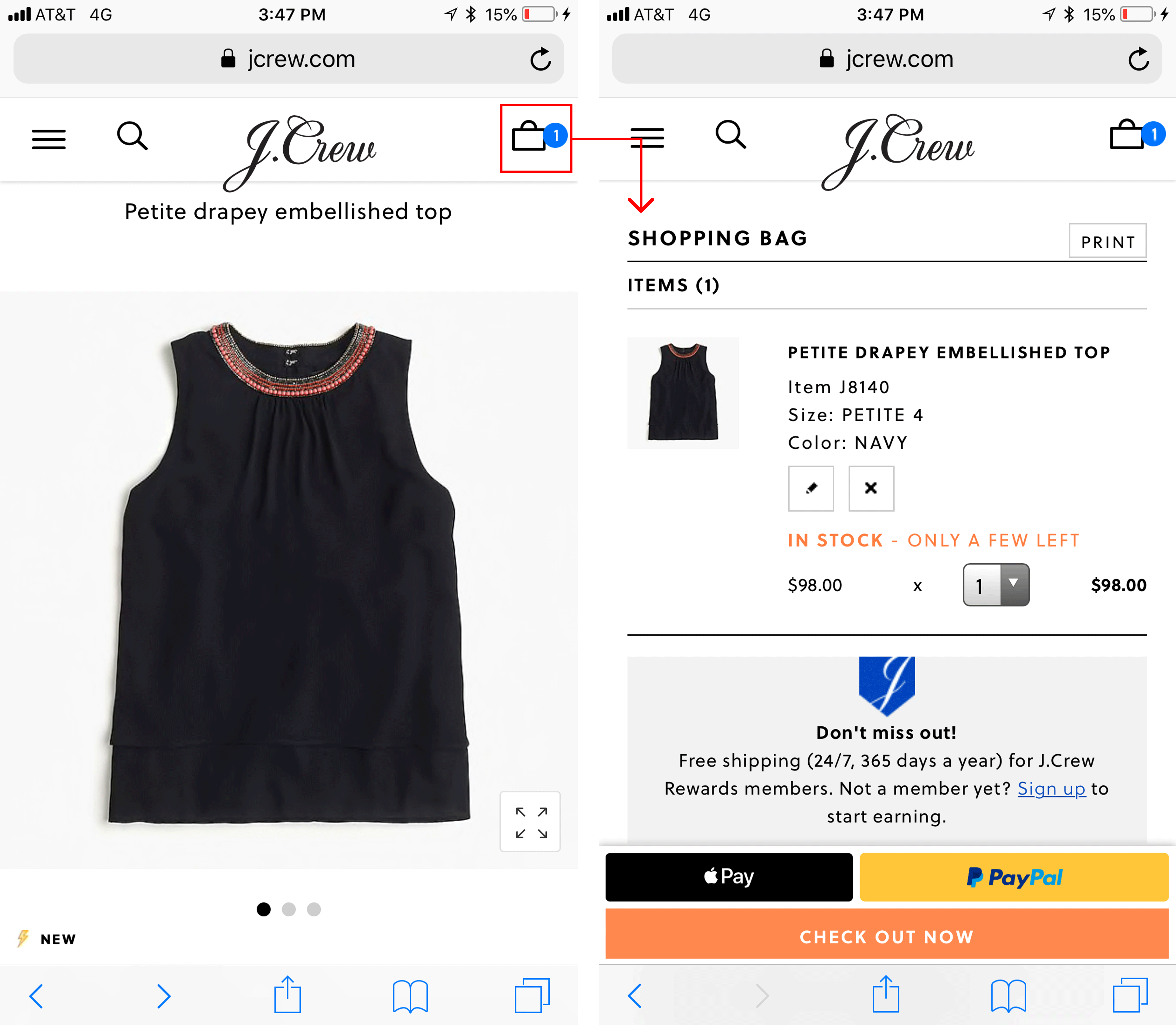
Provide quick access to the mobile shopping cart. Tapping on the shopping cart indicates a desire to move forward, so get users to the cart as quickly as possible. Avoid performance related delays and remove any unnecessary obstacles that may get in users’ way when trying to access the cart.
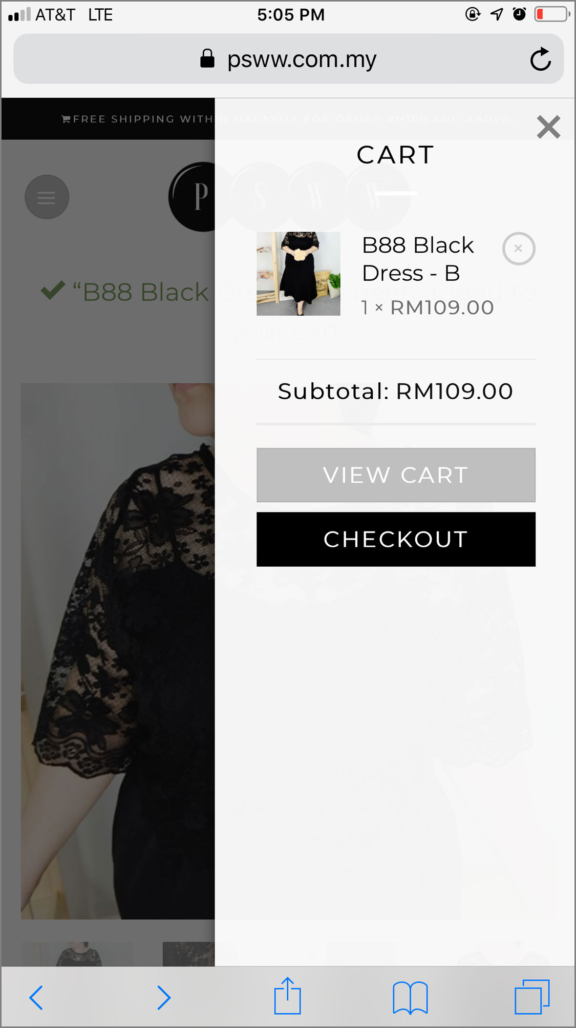
This J.Crew design represents a good example of easy access to the shopping cart. When an item was added to the cart, a badge on top of the cart icon gave users immediate feedback. Tapping on the cart icon took users to the shopping cart page without extra clicks, popups or additional steps.On PSSW, tapping the cart icon revealed a mobile mini cart. Users then had to tap View Cart or Checkout to access their full shopping cart and order details. This extra tap is unnecessary. When users tap the shopping cart icon, take them directly to their cart.
Make it easy for users to update the contents of their shopping cart. People often change their minds about purchasing a product or accidentally add an item to the shopping cart twice. Allow users to easily change the contents of their shopping cart.
Give users a clear Remove button next to each item in their cart. Don’t force them to change quantities to zero in order to delete a product from their shopping cart.
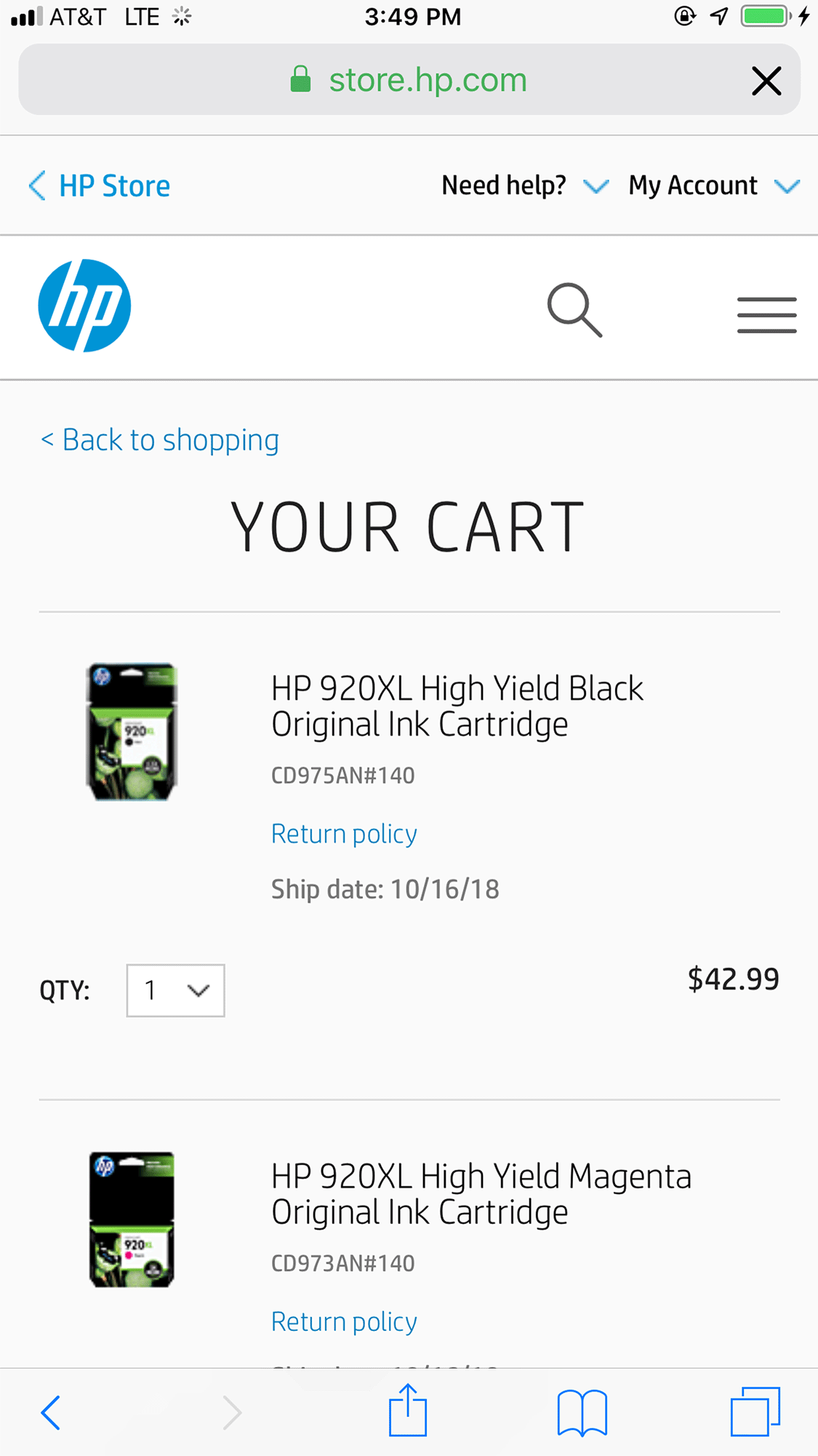
While shopping on HP’s site, one study participant became frustrated when she couldn’t figure out how to remove an unwanted printer cartridge from her cart because she was supposed to set the quantity to zero. As a result, she purchased the printer cartridges from Amazon instead.
HP did not include a clear Remove button next to each item in the cart and required users to change the quantity to zero to remove items. This design was unintuitive and caused frustration.
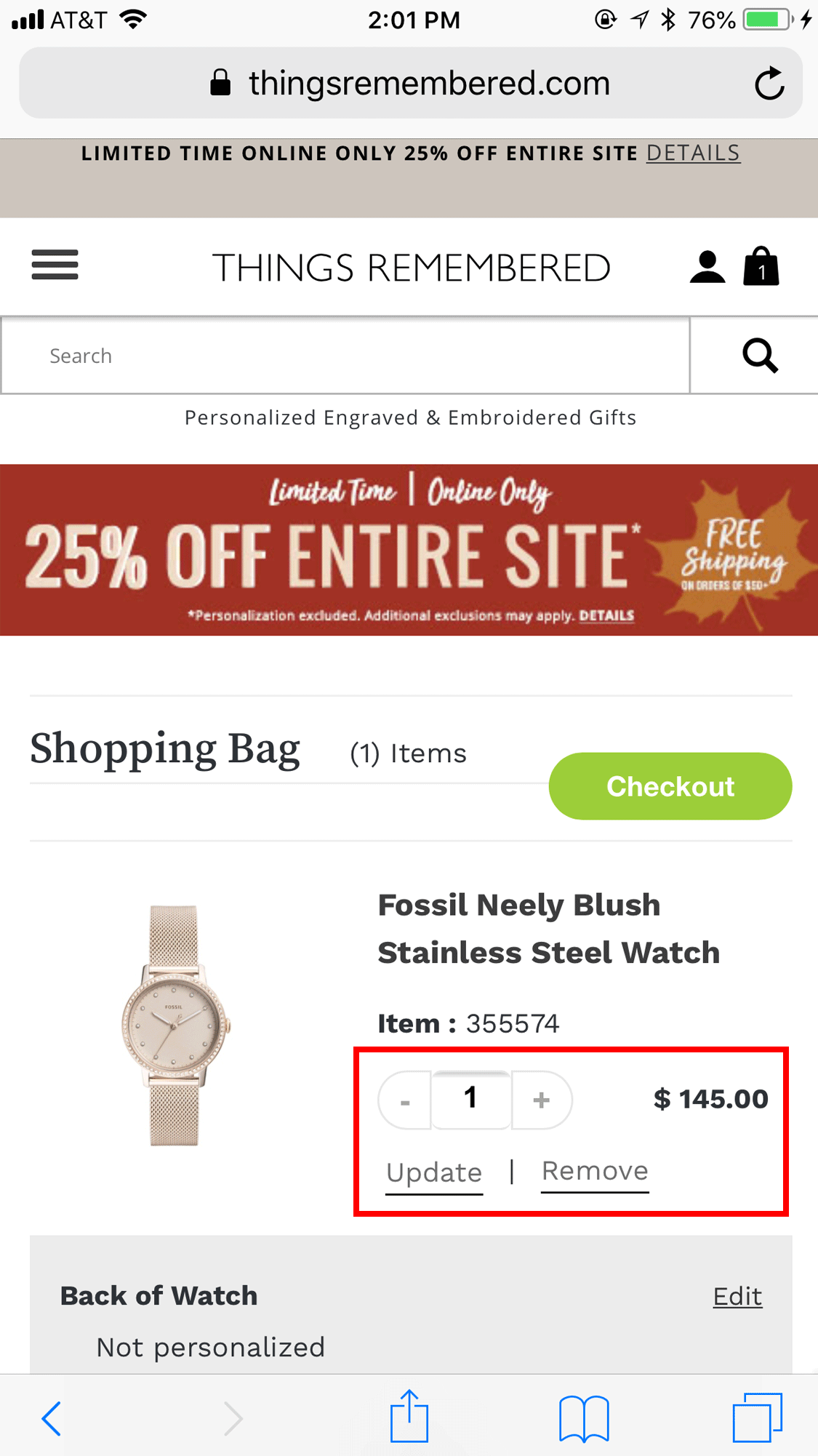
Don’t use an Update button for committing changes to the shopping cart. Some sites force users to tap an Update button for any change to their shopping cart to become effective. Someone who wants to change the quantity of an item must therefore indicate the new quantity and then press Update to commit the change.
This design is suboptimal for two reasons: users must perform two actions to change the item and people often fail to tap the Update button because they forget or do not realise they are supposed to do so.
Things Remembered required users to tap the stepper and then the Update link to change the quantity of an item. This adds an unnecessary action.
Support continuity of the shopping experience across multiple devices. As brands continue to develop across channels, users’ expectations for easy access, flexibility and consistency while shopping continue to rise. Because users move between channels while shopping, it is important to give them reliable access to their carts on desktop, mobile web and mobile apps.
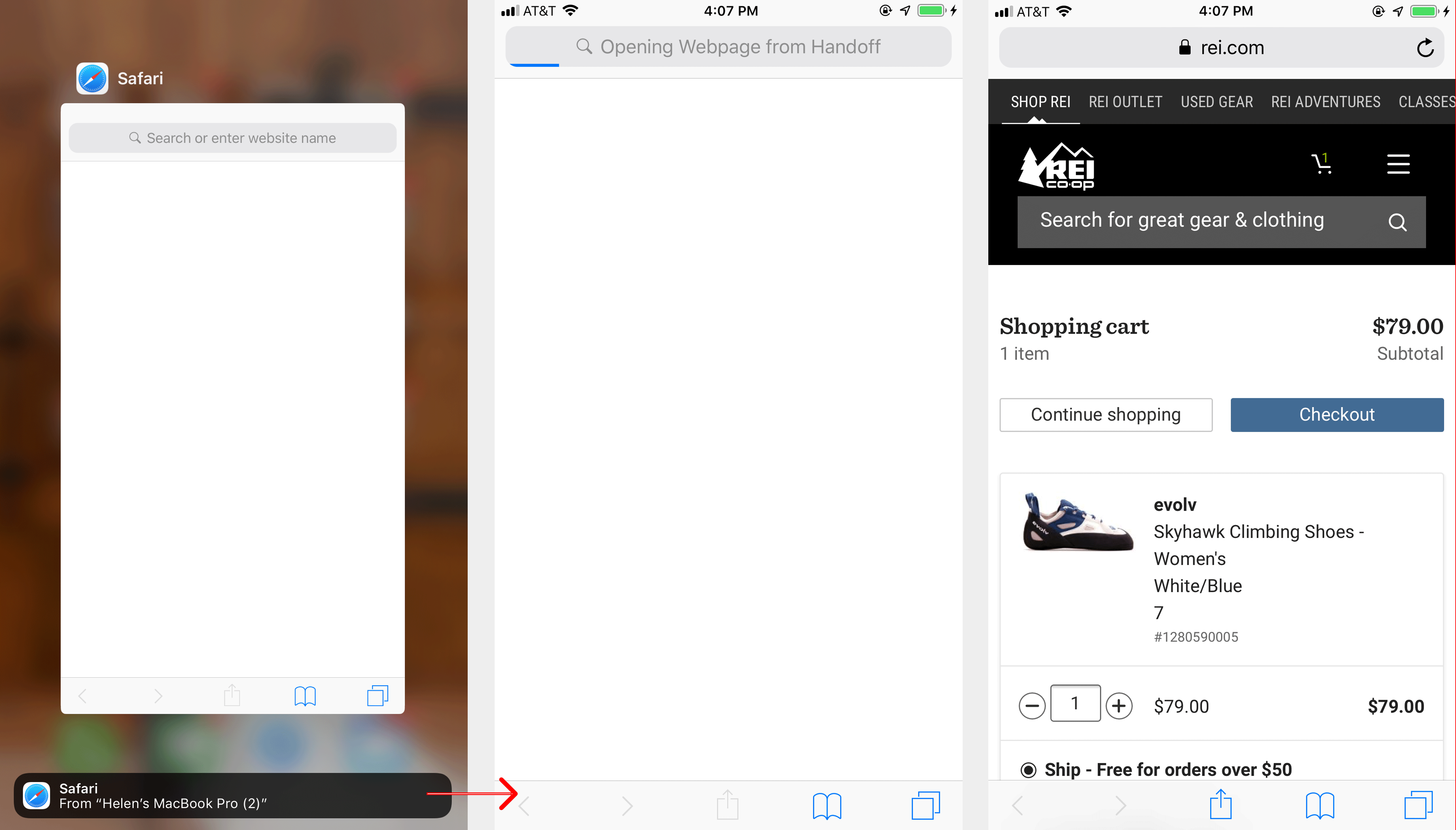
Users of Apple devices can benefit from a feature called Handoff, which allows them to use a website in Safari on one Apple device and then continue the same experience on another compatible device.
Handoff allows Apple users to move between devices and continue the same browsing session. In this example, a shopping session started on a computer and continued on an iPhone.
An application can also hand off the user’s session to another device where the application has been designed to support the feature.
To support seamless cross device transitions outside the Apple environment, make sure a shopping session can be resumed on another device once the customer is logged in. Labels showing when items were added and which device or channel they came from can also help customers understand a saved basket.
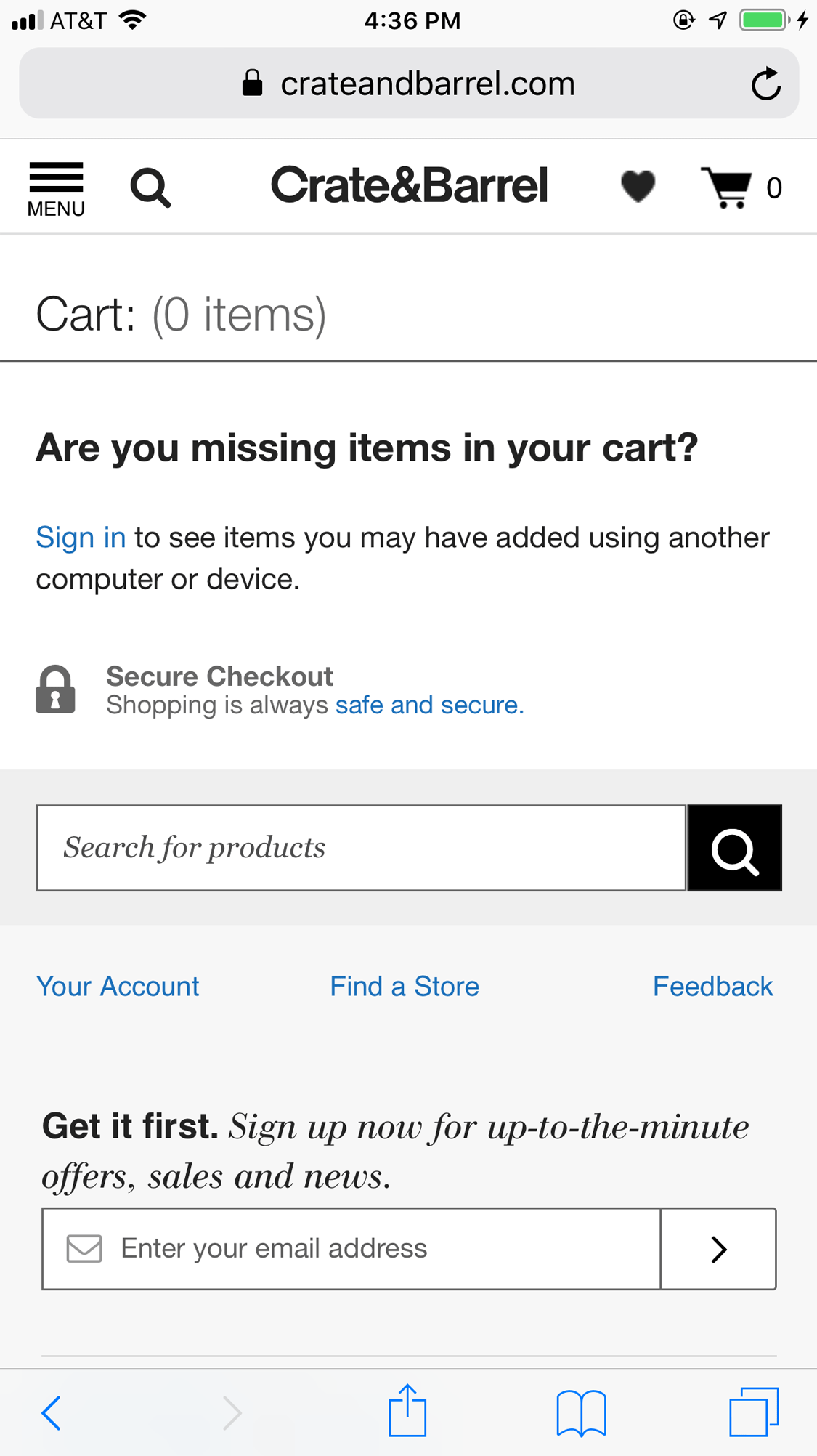
Crate and Barrel displayed a message on its empty shopping cart page explaining that users could access items added from other devices by signing in.
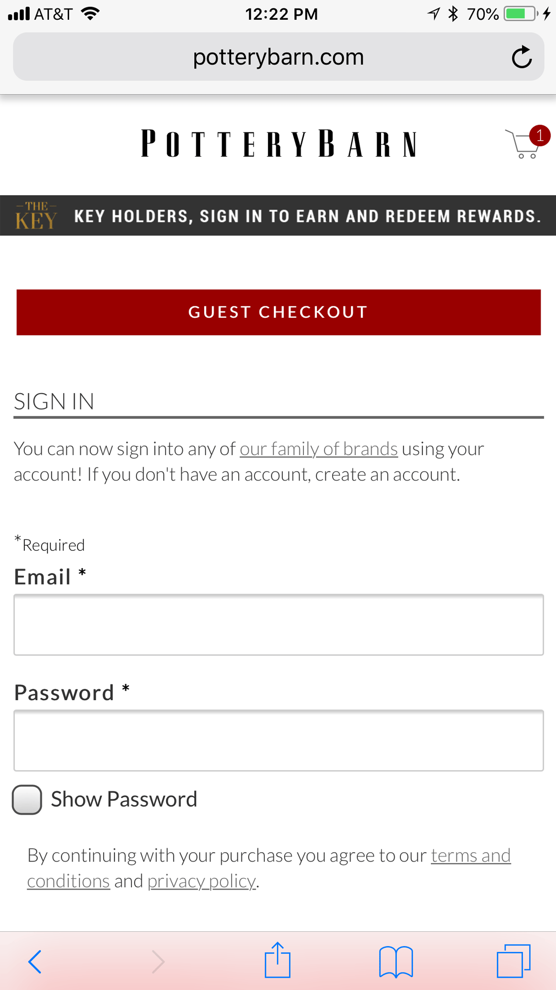
Make guest checkout prominent and easy to find. Even people who have an account forget passwords. In many cases, it will be easier for them to check out as a guest than recover a password on a mobile device. Make guest checkout one of the most prominent checkout options.
Pottery Barn placed guest checkout prominently in the viewport so mobile customers did not have to search for it before proceeding.
Order Summary and Pickup Options
Shoppers do not appreciate inaccurate or unclear prices and grow frustrated when costs unexpectedly increase during checkout. When this happens, customers may abandon their carts and look elsewhere, particularly where shipping or delivery charges appear unexpectedly.
Make the order summary easy to find in mobile layouts. Details including subtotal, taxes, fees, discounts and shipping charges are important for any checkout flow. On mobile, limited screen space makes placement especially important. Show the order summary prominently instead of making shoppers search for the final cost.
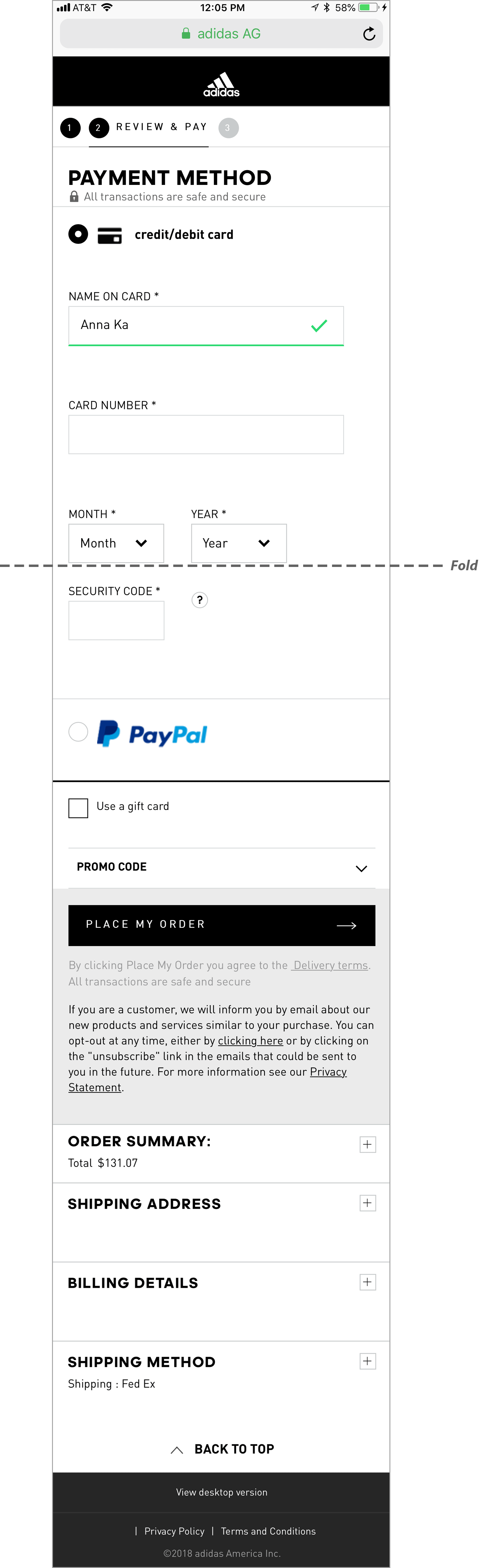
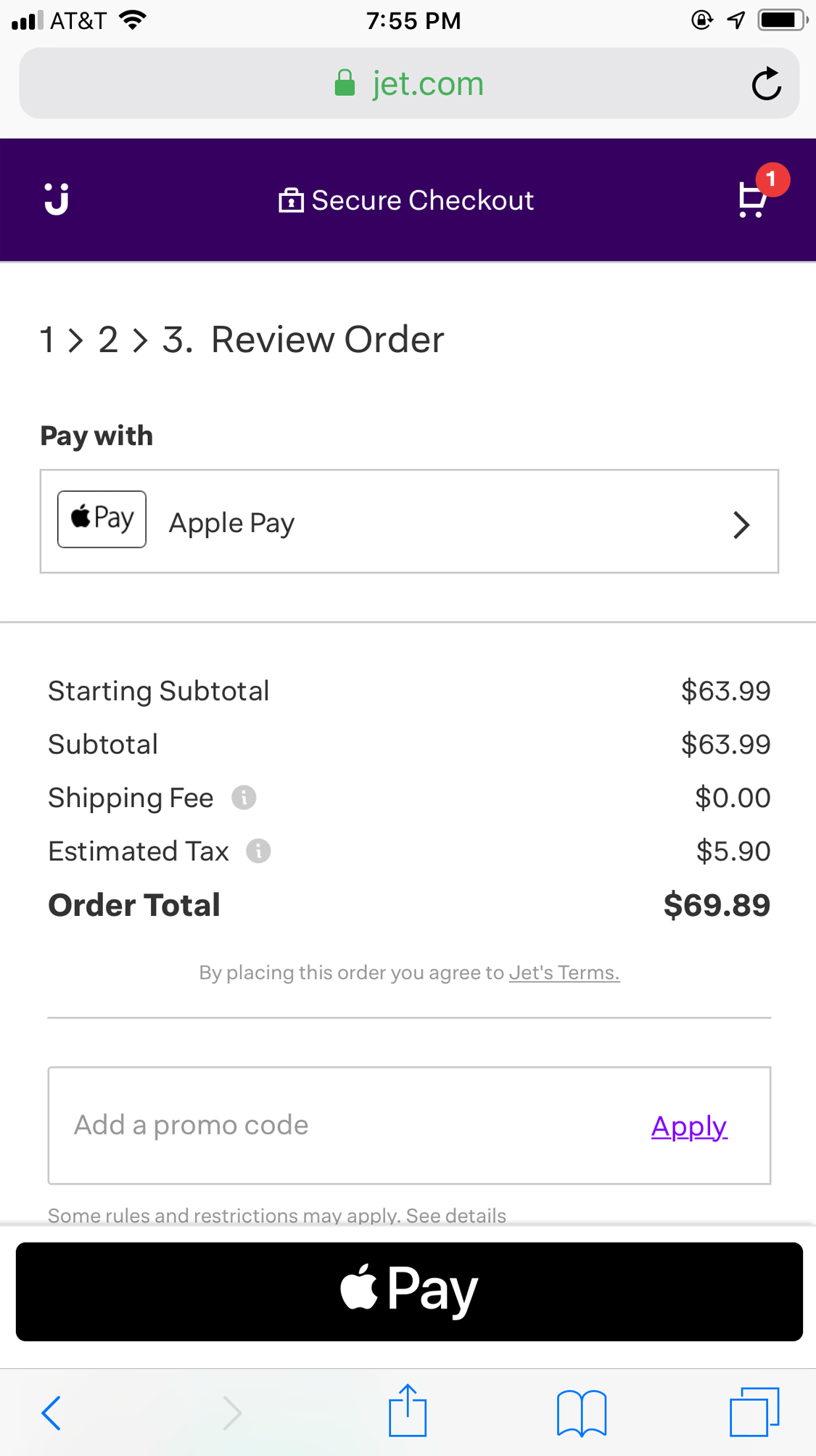
On this Adidas checkout, the order summary was positioned too low on the page and collapsed inside an accordion. Users had to move through much of the page before seeing the complete price.Jet placed the order summary prominently on its Review Order page. Users could clearly see the individual costs and order total before completing the purchase.
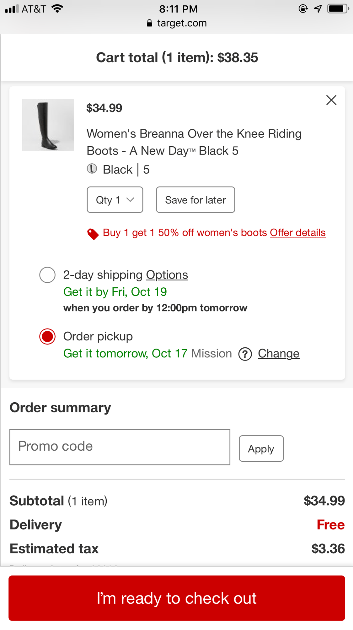
Use the user’s current location where appropriate to determine taxes, delivery costs and pickup options. Delivery costs and tax can depend on the customer’s location. Where location information genuinely improves the journey, ask permission before using it and allow the customer to change the location easily.
Target used location information to provide store pickup options and estimate costs in the order summary.
Form Fields and Input Interactions
Filling in forms on mobile can be time consuming and error prone. Reducing the number of fields and automatically completing information where appropriate can make checkout considerably easier.
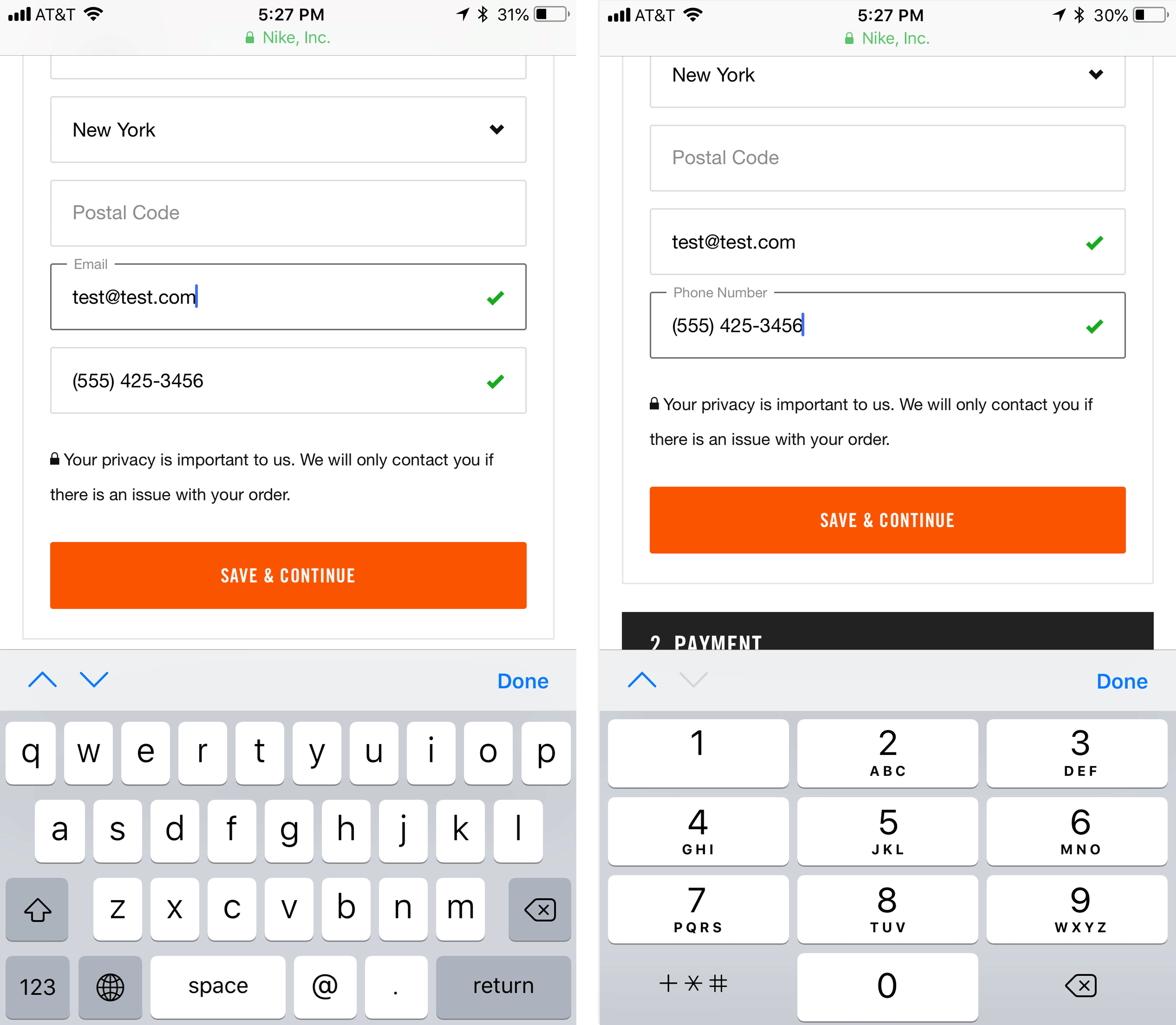
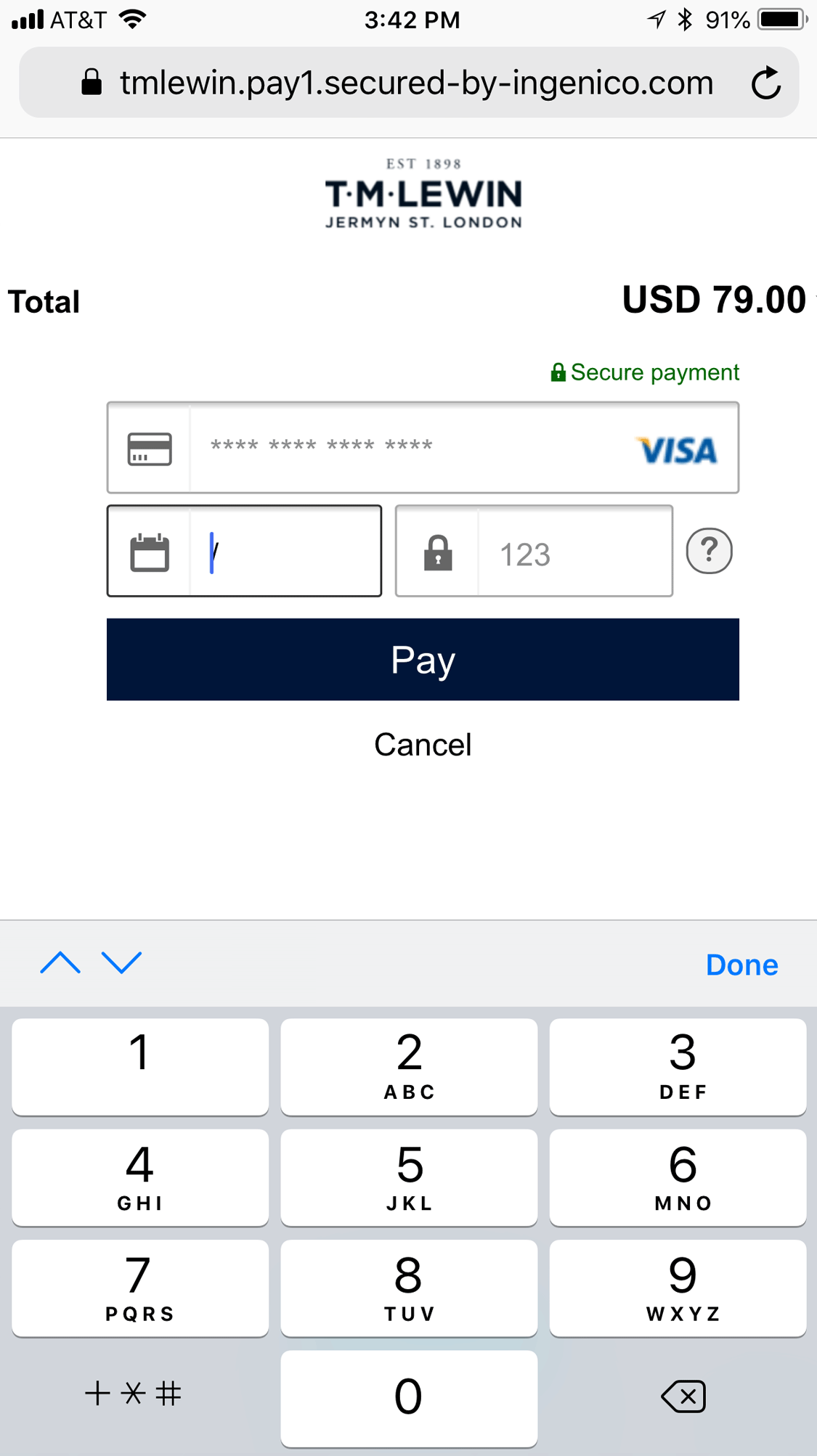
For each field, present the correct keyboard. Use a numeric keypad for numeric data such as telephone numbers and payment information. For email address fields, use the keyboard designed for email entry so useful characters such as @ and . are readily available.
Nike displayed the appropriate mobile keyboards for email and telephone fields.
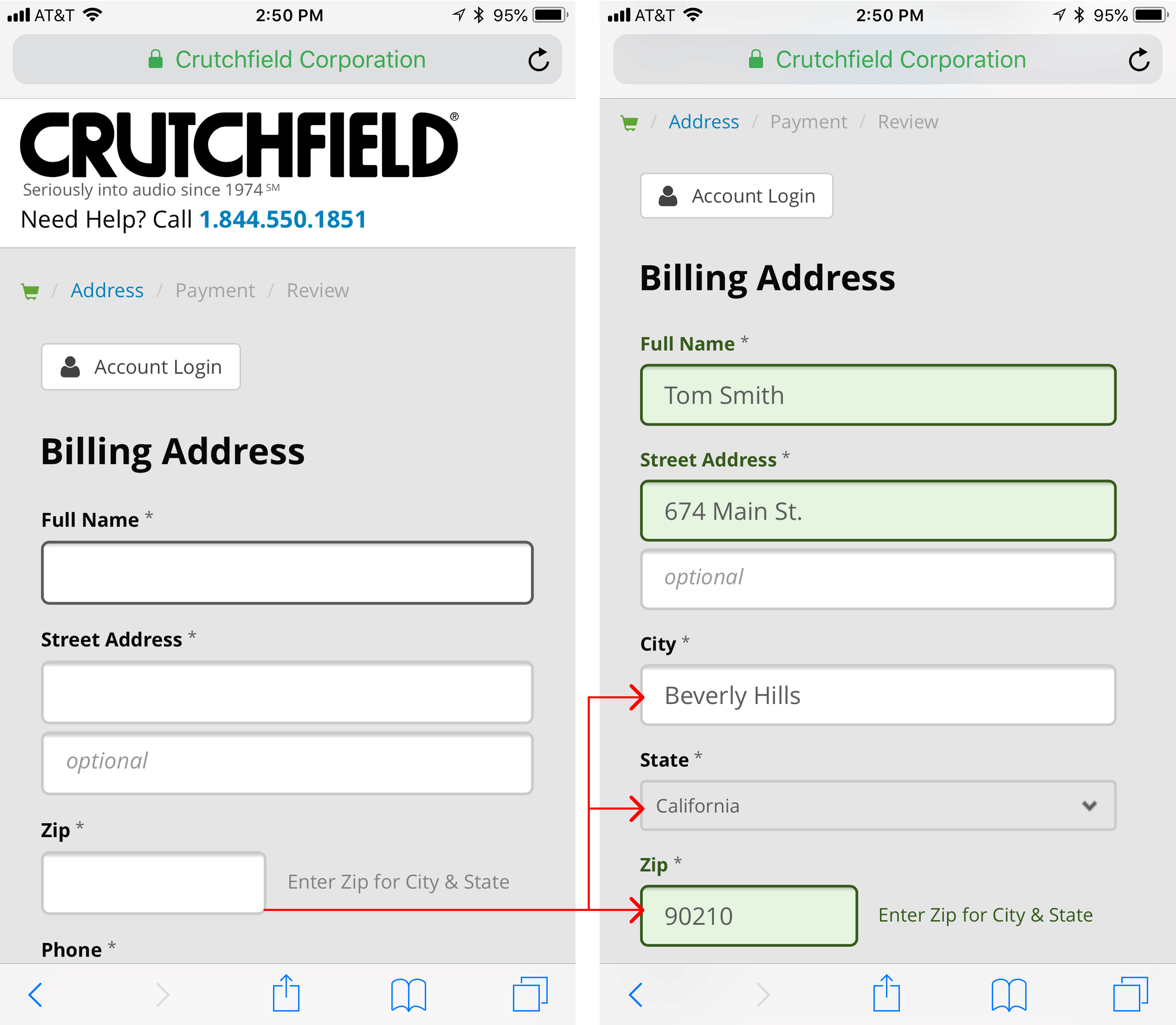
Calculate fields automatically based on users’ prior inputs. Information such as city or region can often be determined from a postcode or ZIP code. Where this is reliable, do the work for the customer while still allowing them to correct the information.
Crutchfield used the ZIP code to populate other address fields while keeping the resulting information editable.
Browser autofill and saved data should work properly. Name, address, email address, telephone number, password and payment fields should be coded so the browser can recognise them and provide relevant saved information where the user chooses to use it.
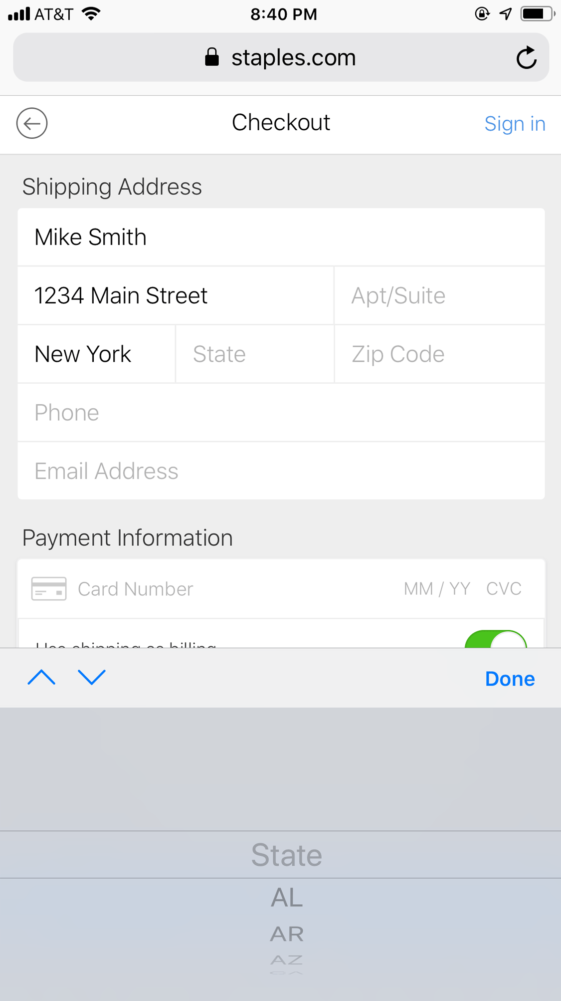
Avoid cumbersome selection controls where simple input is quicker. Long dropdown lists can create unnecessary effort on mobile. Choose the interaction according to what is quickest and least error prone for the customer.
This Staples checkout demonstrates how a long mobile picker can make a simple piece of information harder to enter.TM Lewin used direct input for payment information and presented the numeric keypad to make entry easier on mobile.
Easy Payment on Mobile
Entering payment details can be slow and error prone on mobile. Digital wallets and saved payment information can reduce the amount of typing required and make the final part of checkout considerably easier.
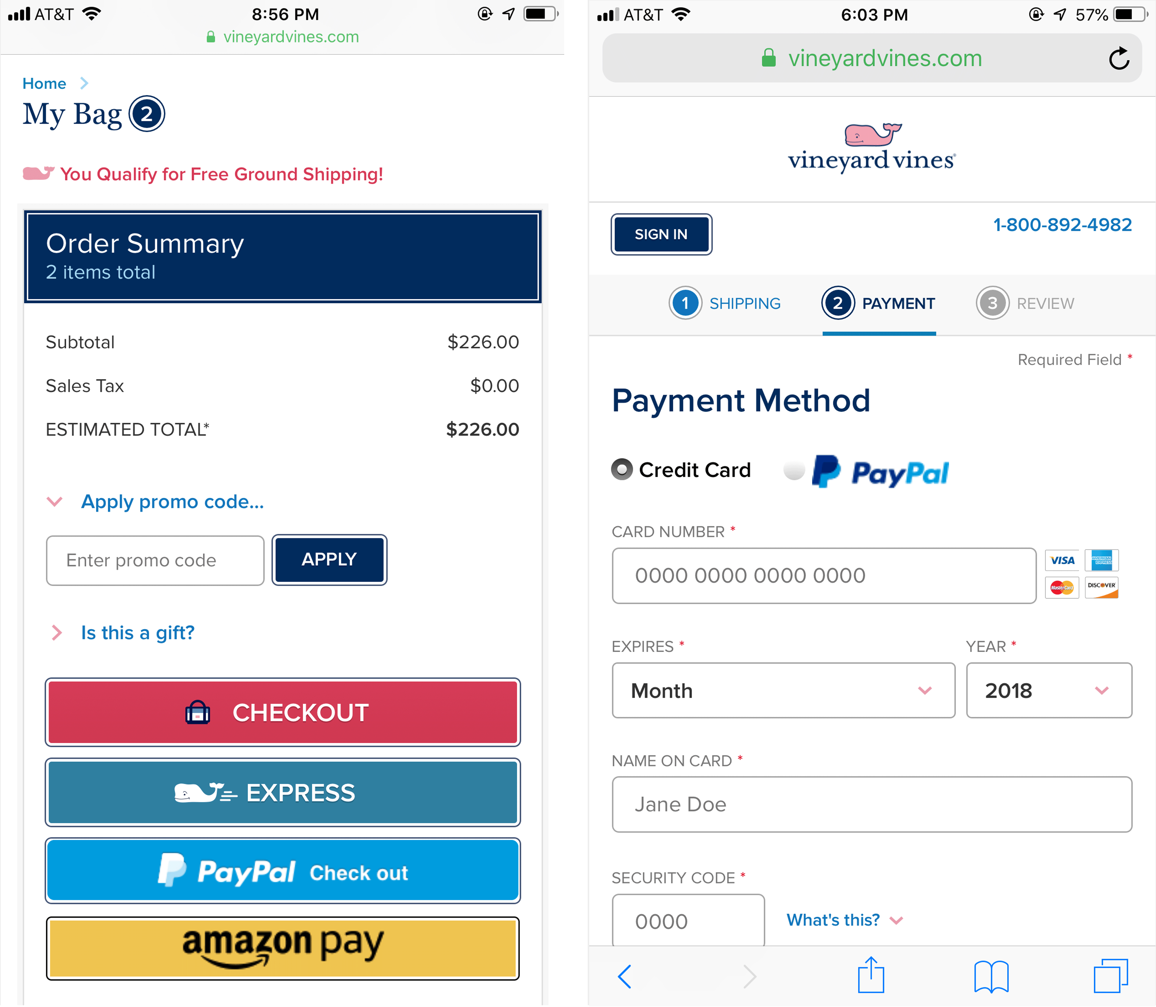
Offer mobile friendly payment options without overwhelming users. Recognisable payment options such as PayPal and Apple Pay can make checkout easier, but too many alternatives can introduce choice overload. Make the distinctions clear and give suitable prominence to the payment routes customers are most likely to use.
Vineyard Vines offered mobile friendly payment methods during the checkout journey.
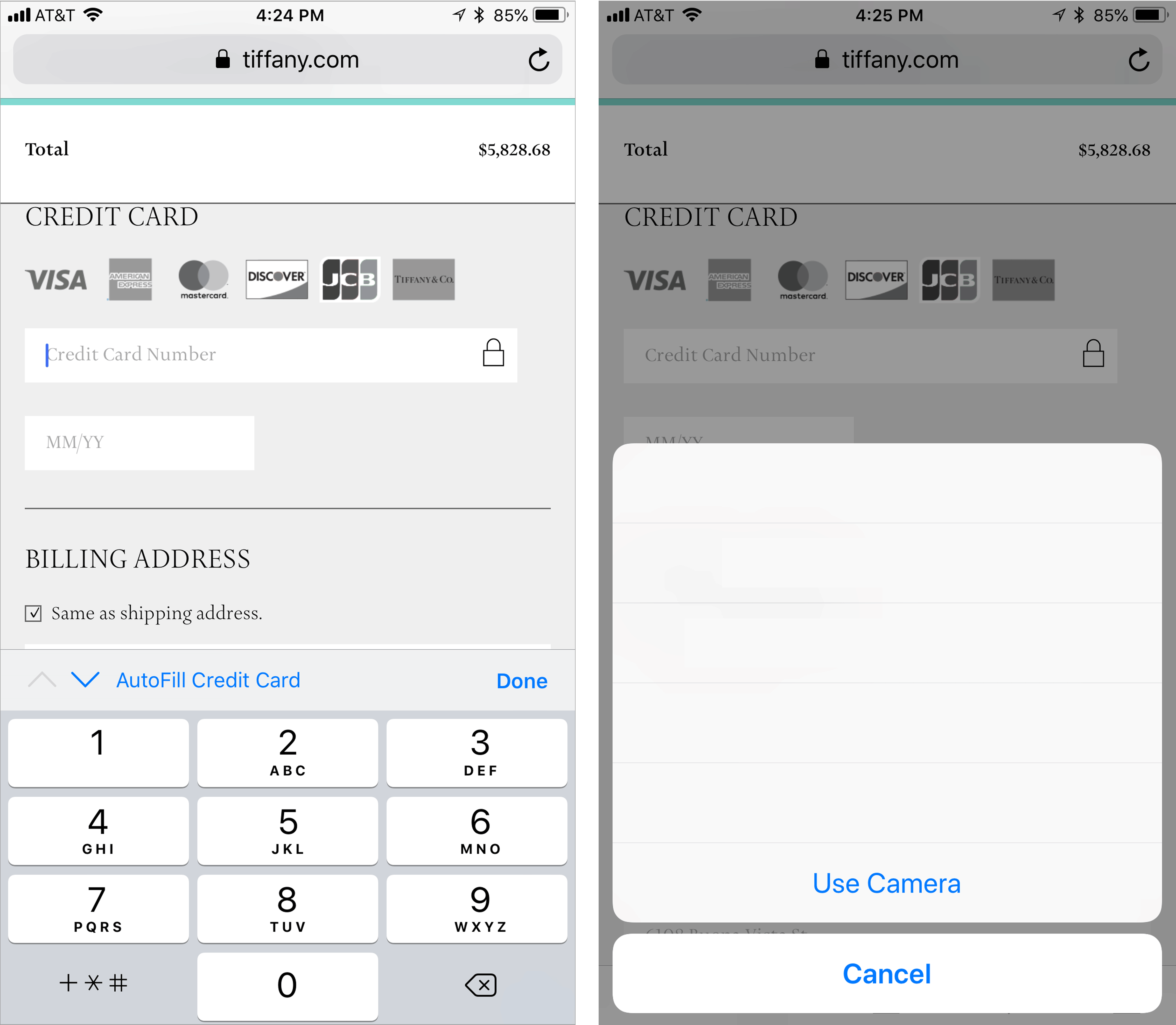
Take advantage of built in payment and autofill features. Mobile browsers and operating systems can reduce the need to type payment information manually. Forms should be built so these features work correctly where customers choose to use them.
Tiffany supported Safari’s credit card autofill feature, allowing customers to use the device camera to help enter payment information.
Conclusion
What distinguishes the best mobile checkout experiences is attention to the small parts of the journey. Mobile focused interface decisions can reduce friction, make information clearer and help customers move through checkout with less effort.
You enter your website and a few details about your business. We run a structured analysis across how your brand, website and marketing are performing. This covers messaging, user experience, technical performance, visibility in search and AI search, and how your current activity is likely to be converting.
You receive a clear breakdown of what is working, what is underperforming and where the biggest opportunities are. No guesswork. No generic advice. Just a practical view of where performance is being lost and how it can be improved.
We will show you how we would fix it. If not, you still leave with a clear understanding of where you stand.
How much does it cost?
This depends on how you engage with WLW. Daily website tasks start from £25, and entry-level advertising channel management starts from £999 per month.
Are you just a UK agency or you work in other countries?
WLW FUTURE is UK-based, but we deliver projects and campaigns globally through our core team and wider associate network. We regularly support work across Europe and other international markets, depending on the scope and requirements.
We also have a presence in Lyon, which acts as a base for France and wider European activity.
Our team operates across multiple languages including French, Hindi, Chinese, Russian, Somali, Spanish, Norwegian and Swedish, allowing us to deliver campaigns that are properly adapted to local markets rather than simply translated.
Do I have to sign a contract?
No. Campaign work can be run on a pay-as-you-go basis. For project work, we agree scope and pricing upfront, but we avoid unnecessary long-term contracts.
Can you work for free or on a commission basis?
Yes, in selected cases. If there is clear commercial potential, we are open to structured commission or performance-based agreements, subject to a fair agreement.
Have you seen campaigns and projects fail?
Yes. This usually happens when execution is restricted by requirements that go against how marketing and advertising actually work. We are always clear that results are not always immediate. Some campaigns take time to build momentum, and that is normal.
How do you normally work with customers?
“Helping brands get on top of things.”
WLW FUTURE is a creative media and operational hybrid agency. Every project starts lean and remote, led by one senior specialist per task, project or campaign. If more depth is needed, we scale from within our 20+ core team to deliver end-to-end. For larger or more complex programmes, we extend into a trusted partner network.
The result is a joined-up delivery model with fewer layers, faster execution and better commercial focus.
What digital channels do you work with?
We work across paid social including Meta, TikTok, YouTube, Pinterest and Snapchat, as well as online publications. Paid media covers native, programmatic, ATL, direct buys, display and SEM. We also focus on AEO, which is query-led visibility across AI and search environments.
Our work includes digital PR and affiliate activity such as outreach, influencer partnerships and affiliate marketing. We plan and deliver content strategy across themes, formats and campaigns, supported by creative production including video, animation, graphics and campaign assets.
Performance is tracked through cross-channel analytics, ROI measurement and reporting, alongside audience data collection and insight analysis. We also manage and grow organic social across all major platforms.
Do you do email marketing?
Yes, it is one of our core channels and one of the closest things to word of mouth when done properly. We have been working in this space since 2014, combining strategy, content and automation to drive consistent results.
We use the latest platforms and technologies to maximise performance, from list growth and segmentation through to campaign optimisation and lifecycle automation, ensuring email becomes a reliable and scalable revenue channel rather than just a broadcast tool.
Where we typically get involved
We usually enter at the point where a business knows something is not right.
Before a website rebuild or platform investment. When marketing spend is increasing without clear returns. When entering new markets or repositioning. When growth has plateaued or become inefficient. When internal teams need clearer structure and direction.
From there, we connect the pieces and build forward.
Newsletter signup
Enter your email to receive exclusive research and insights from the WLW FUTURE team. By signing up you agree to our privacy policy.
Book a 15 minute requirements call
We'll reply back and arrange a suitable time of your choosing.