
Are you a business without a website? We'll create you a free website if you sign up to us being your marketing and advertising partner. Interested? →
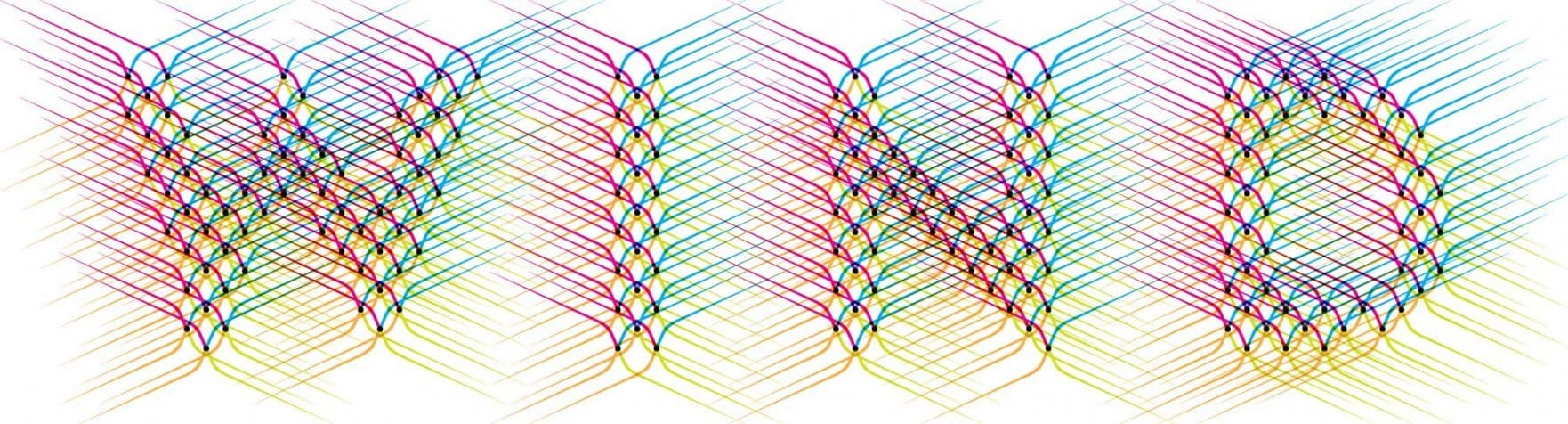
WIND is a Layered Typeface for Optical Illusions
Wind is the first published typeface of Amsterdam-based book and graphic designer Hansje van Halem. Like her other work, which is highly experimental, it uses vivid colours and intricately detailed patterns to create unexpected optical illusions, and its various layers can be combined and overlaid to create vibrant, hypnotic patterns.
 In addition to four static styles, NE, SE, SW and NE, Wind also includes variable fonts capable of a full 360° of rotation, (one clockwise, the other anti-clockwise), offering unprecedented possibilities for the exploration of repetitive textural patterns. While most of Van Halem’s work is highly personal, Wind is a tool for graphic expression, as intuitive as it is systematic in its exploration of the limits of legibility and the differences between reading and viewing.


 Designer’s site: http://www.hansje.net/WIND-a-Layered-Typeface-for-Optical-Illusions
Where to buy: https://www.typotheque.com/fonts/wind