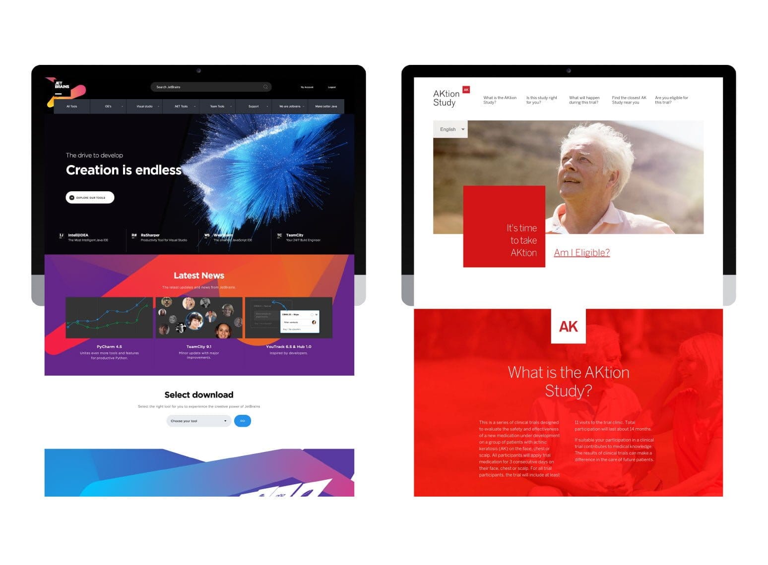
10 amazing examples of interaction design

People rarely see your whole business. They experience individual moments: a search result, a menu, a product page, a button, a form, a payment screen, an email or a support message. Each one adds to the impression they form.

Interaction design is where those moments become behaviour. It decides what a person can do, what the product does in response and whether the next step feels clear.

A polished interface can still be frustrating if it hides status, interrupts people, asks for too much too early or makes recovery difficult. A simpler interface can feel excellent when it responds quickly, preserves context and makes progress obvious.

Analysis by David Holly, Founder and Strategy Director at WLW FUTURE | Updated 28 August 2026 | Originally published 20 August 2018

Actionmake it clear what a person can do
Feedbackshow what happened after they did it
Contextkeep people oriented as the interface changes
Recoveryhelp people correct mistakes without losing progress
The WLW position
Good interaction design answers three questions without making people work for the answer: What can I do? What just happened? What should I do next?

What is interaction design?

Interaction design is the design of the dialogue between a person and a product or service. On a website or app, it includes the words people read, the controls they use, the visual response they receive, the time an action takes and the way the product behaves as circumstances change.

The established five dimension model remains a useful way to think about the subject. It covers words, visual representations, physical objects and space, time and behaviour. The value of the model is practical: a digital interaction does not happen on a static artboard. A person is using a particular device in a particular situation and expecting the interface to respond.

Interaction Design Foundation

WordsLabels, instructions, questions, messages and the amount of information shown
VisualsLayout, type, imagery, icons, hierarchy and signals which support understanding
Physical contextThe device, input method, screen, environment and physical conditions around the user
TimeProgress, response speed, motion, sound, waiting and what changes from one moment to the next
BehaviourWhat the person does, how the system reacts and what the interaction encourages them to do next

Why interaction design matters commercially

People are usually trying to complete something: find an answer, compare options, submit information, buy, book, move money, get support or control a product. Interaction design influences whether those tasks feel obvious or difficult.

Confidence

Clear feedback tells people the system has understood them and reduces uncertainty

Effort

Better sequencing and sensible defaults reduce unnecessary decisions and repeated work

Recovery

Good states and messages help people correct mistakes without losing progress

Completion

A visible next step makes it easier for people to continue through the journey

Interaction design is behaviour, not decoration

The strongest examples below use movement, state, feedback and interface controls to help people complete a real task. The value comes from what the interaction makes easier to understand or do.

1Make the available action obvious
2Respond visibly when the action happens
3Preserve useful context as state changes
4Keep the next useful step clear

10 interaction design examples worth studying

I chose these examples because each solves a recognisable user problem. The strongest interaction design is rarely decoration. It gives people useful control, keeps them informed or removes a piece of friction at the point where it matters.
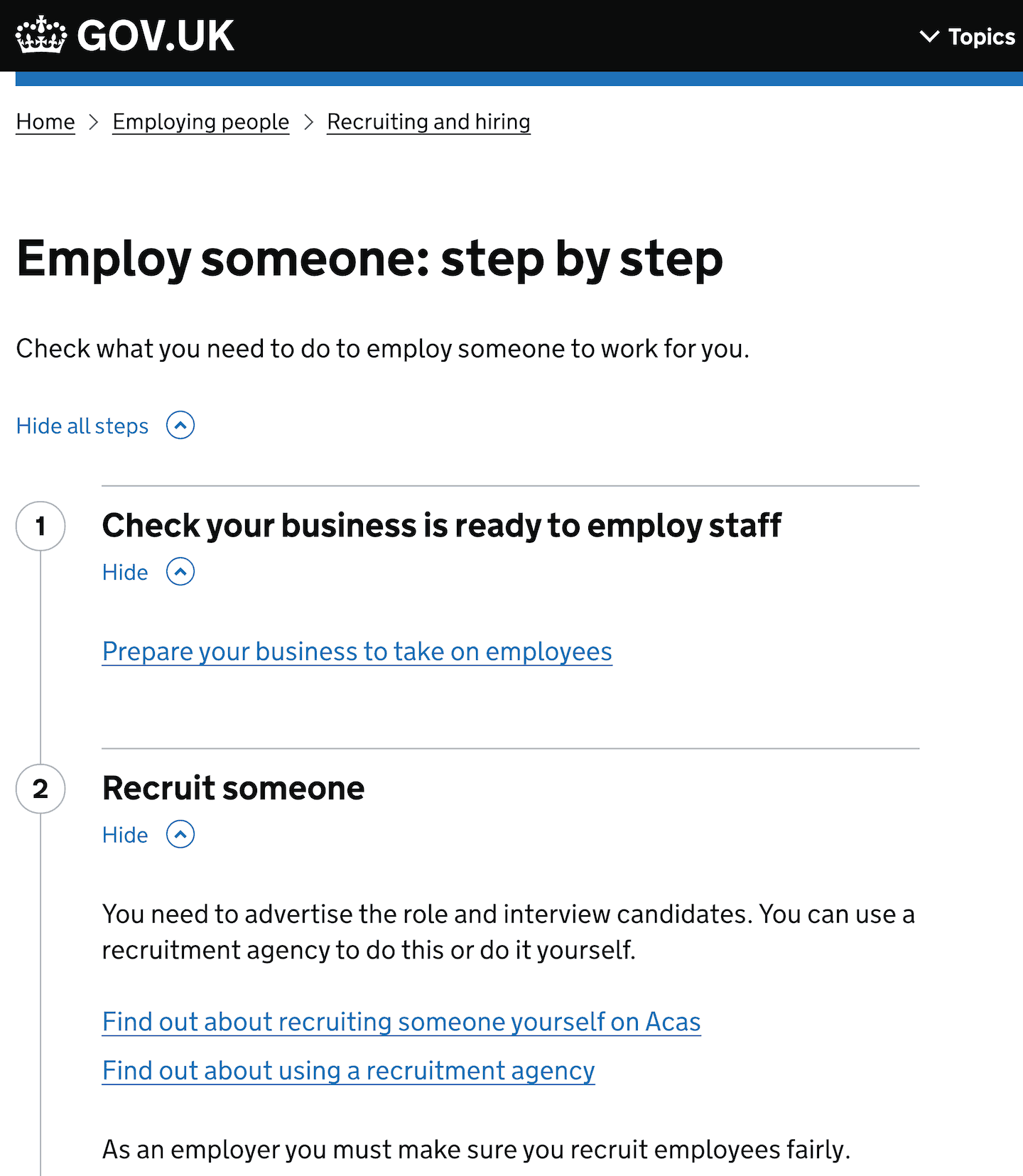
GOV.UK step by step navigation for employing someone
Reference image: GOV.UK Design System. View source
Example 01

GOV.UK: turn complex processes into understandable steps

Government services can involve guidance, eligibility, documents, payments and actions spread across different departments. GOV.UK uses step by step navigation to turn those journeys into a visible sequence.

The interaction makes progress legible. People can see where they are, what comes next and which tasks sit inside each stage. Sections can be expanded without forcing a person to leave the overview, so the page keeps the wider journey in view while revealing detail when it becomes useful.

GOV.UK also documents the limits of the pattern. It is intended for journeys with a meaningful order, which is a useful reminder that a familiar interaction should only be used when the structure of the task supports it.

WLW lesson: When a customer journey contains several tasks, show the journey as well as the current task. Progress becomes easier when people can see the shape of what they are trying to complete.
Wise transaction details showing the status of an international transfer
Reference image: Wise. View source
Example 02

Wise: make status visible when uncertainty is expensive

Moving money is a high anxiety interaction. The user has committed something valuable and then has to wait while several systems do their work.

Wise answers the obvious question, where is my money, with a transaction timeline. The interface records what has happened, what is happening now and what the recipient can expect. The transfer is treated as a sequence of visible states instead of a single confirmation screen followed by silence.

Good status design earns trust because it removes the need to guess. The same principle applies to applications, orders, support requests, deliveries and any process where the outcome happens after the initial click.

WLW lesson: If the customer has to wait, design the waiting. Show state, progress and the next meaningful event instead of leaving a blank space between action and outcome.
Stripe mobile Payment Element showing payment method selection
Reference image: Stripe Payment Element. View source
Example 03

Stripe: keep payment choices inside the task

Checkout is a poor place to introduce unnecessary navigation. People have already made a decision and the interface should help them complete it with as little uncertainty as possible.

Stripe's Payment Element keeps payment methods, saved details and new card entry in one controlled interaction. Selecting a method changes what appears in place, so the person does not have to understand the underlying payment system or jump between unrelated screens.

The design also recognises that payment options vary. The interaction can adapt while the overall structure stays familiar. Consistency sits at the level the user needs: where to look, what to choose and how to continue.
WLW lesson: Preserve the task when choices change. The user should be able to switch method, correct information or add missing details without feeling they have restarted the journey.
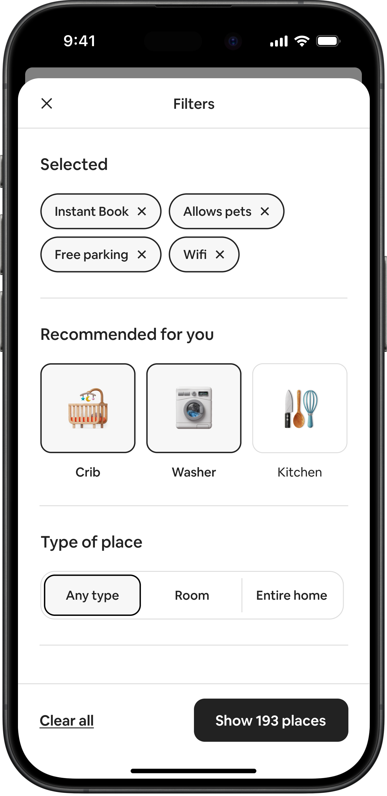
Airbnb mobile filters showing selected criteria and recommended filters
Reference image: Airbnb 2024 Winter Release. View source
Example 04

Airbnb: help people narrow a choice without losing control

Travel search starts vague for many people. A destination may be fixed while dates, property type, amenities and price remain negotiable. A rigid filter system can make that exploration feel like administration.

Airbnb's redesigned filters keep selected criteria visible as removable choices and add recommendations based on the current search and previous behaviour. A single action at the bottom also tells people how many places their current decisions will reveal.

Three useful interactions happen together: the user can see what is active, remove a choice easily and understand the likely effect before committing to the filtered view.
WLW lesson: Filtering works best when people can see the consequences of a choice without losing the context they started with. Keep exploration reversible.
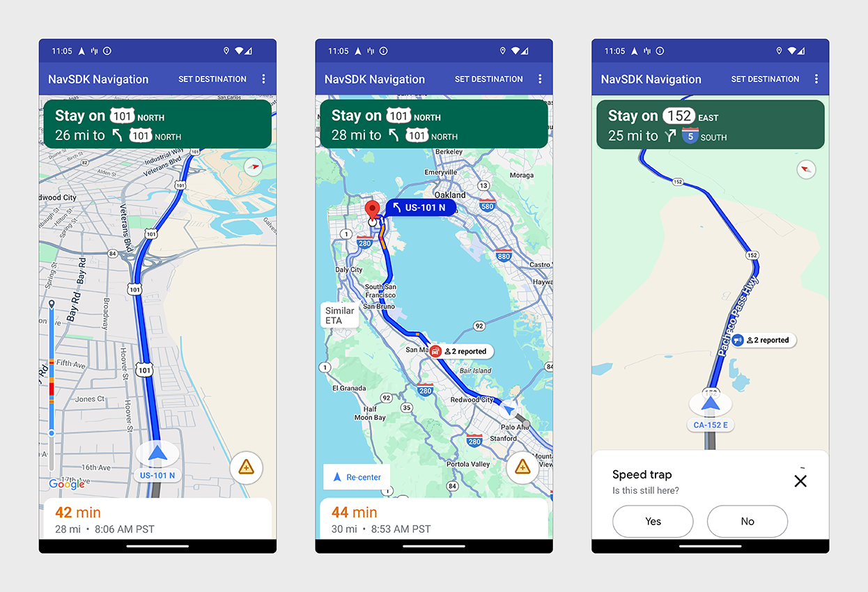
Google Maps navigation screens showing route guidance and route events
Reference image: Google Maps Platform Navigation SDK. View source
Example 05

Google Maps: design for a world that keeps changing

Navigation is interaction design under pressure. The user is moving, the environment is changing and the product may need to alter its recommendation while attention is limited.

Google Maps keeps the current route visually dominant while showing time, direction, position and route events around it. The interface can surface an alternative route or a warning without asking the person to rebuild the journey.

The product also has to distinguish between information which deserves attention now and information which can wait. Good interaction design is partly a decision about priority.
WLW lesson: Design around changing state. When circumstances can move underneath the user, keep the most important current information persistent and let secondary information appear only when it becomes relevant.
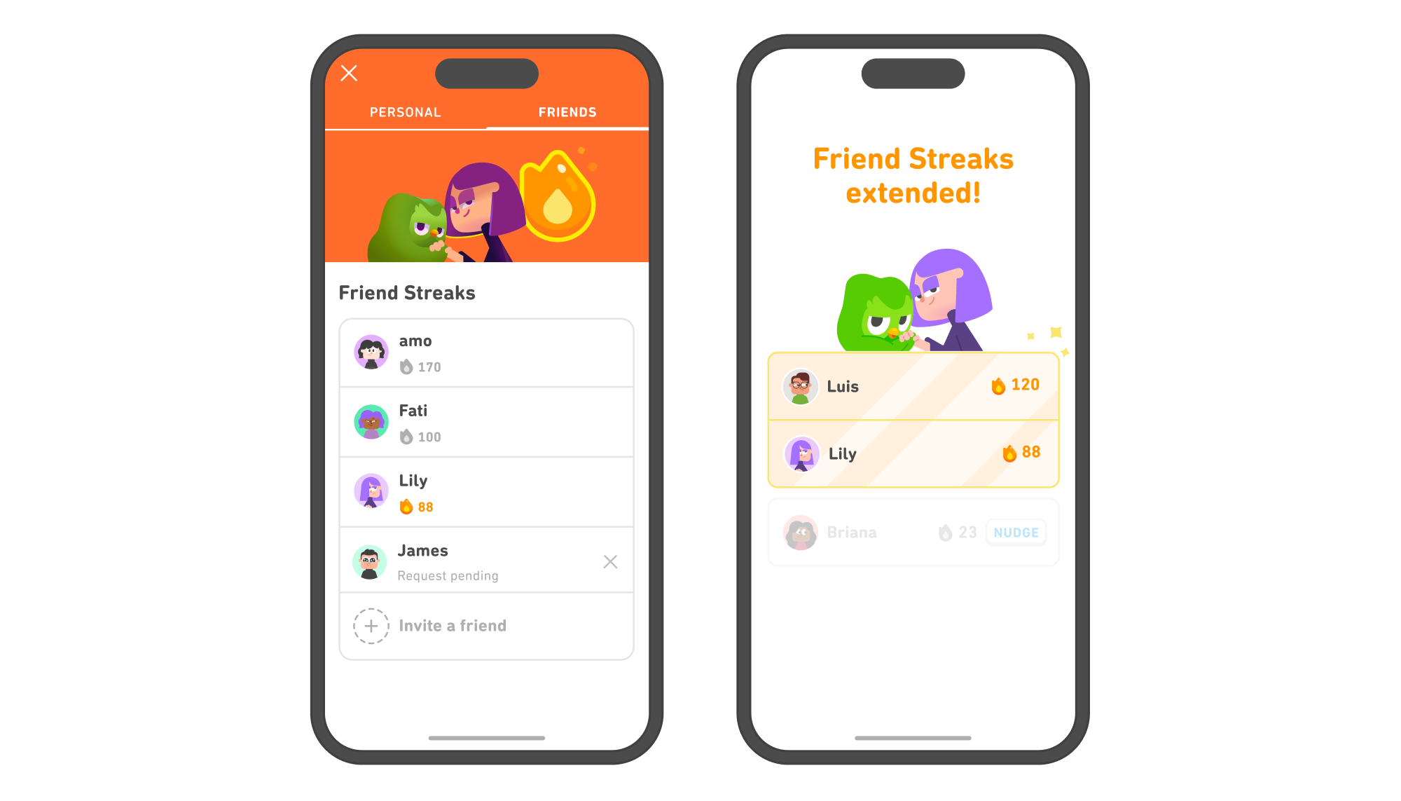
Duolingo Friend Streak screens showing shared streaks and a nudge prompt
Reference image and product finding: Duolingo Friend Streak. View source
Example 06

Duolingo: connect feedback to the behaviour you want to reinforce

Duolingo's streak system turns a repeated learning action into visible progress. Friend Streaks add a social layer: a learner can see shared streaks, invite friends and nudge someone who has not completed a lesson.

The useful interaction is not the flame or character artwork on its own. The interface connects a clear behaviour, doing a lesson, to a visible state which changes when the behaviour happens.

Duolingo reported that learners with at least one shared streak were 22% more likely to complete their daily lesson. The interaction is tied to the core purpose of the product instead of acting as entertainment around it.
WLW lesson: Feedback is strongest when it reinforces the behaviour which creates customer value. Avoid adding game mechanics which have no relationship with the outcome people came to achieve.
Figma collaboration illustration showing several named cursors around the same canvas
Reference image: Figma multiplayer collaboration. View source
Example 07

Figma: make collaboration visible inside the work

Traditional software often treats collaboration as something outside the object being worked on. Messages live in one place, files in another and feedback somewhere else.

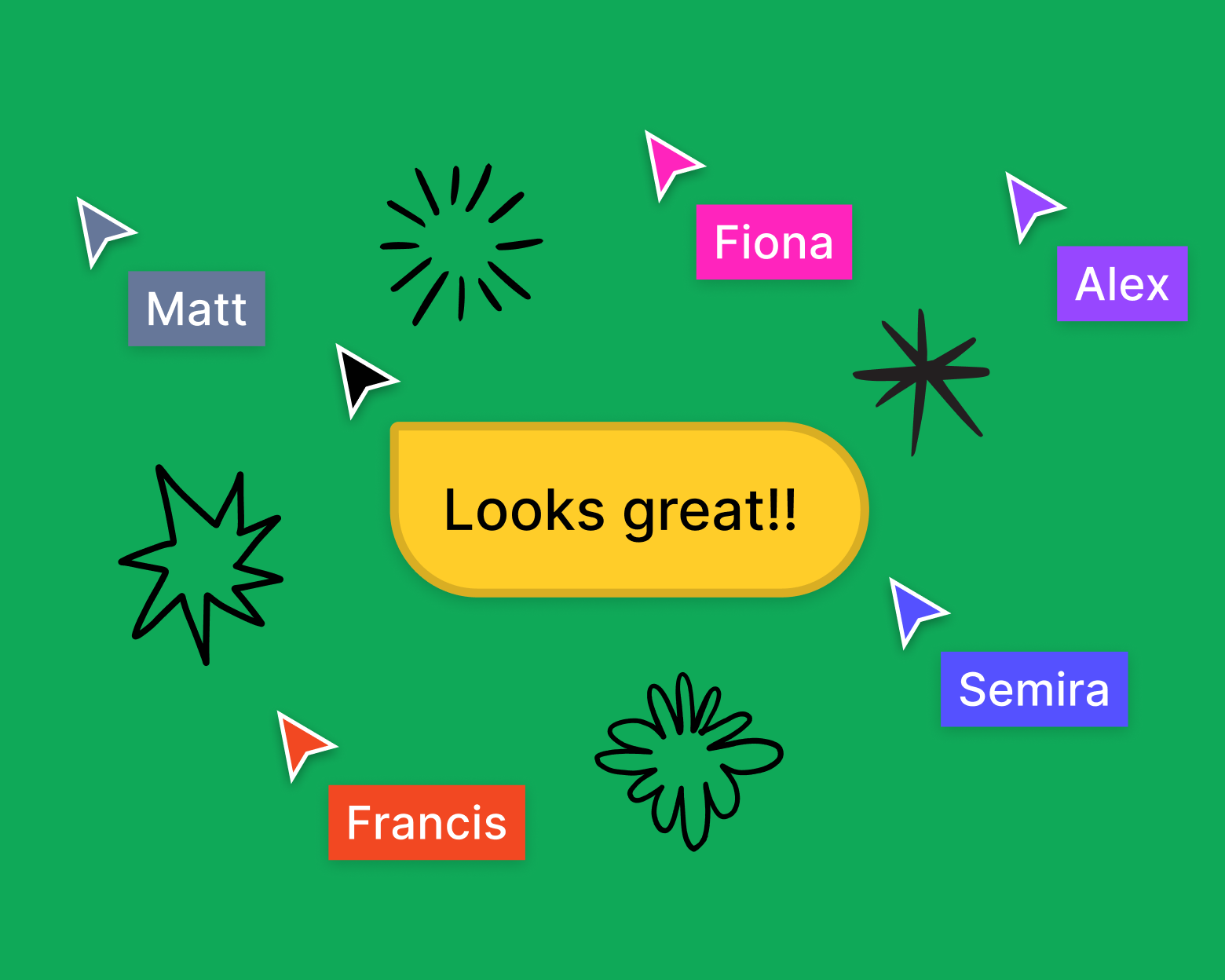
Figma's multiplayer model puts presence into the canvas. Cursors show who is there and where attention is focused. Comments and contextual feedback can sit next to the thing being discussed. The user does not have to translate a comment such as "the box near the top" into a location later.

Presence becomes part of the interaction itself. The interface communicates both the state of the work and the state of the team around it.
WLW lesson: Keep feedback close to the object or decision it refers to. Context reduces explanation, handovers and the risk of people acting on the wrong thing.
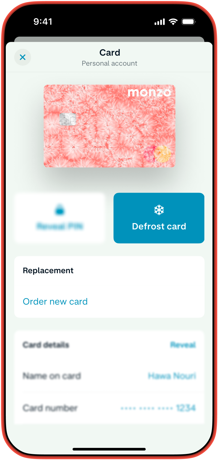
Monzo card management screen showing the option to freeze a card
Reference image: Monzo card management. View source
Example 08

Monzo: make critical actions obvious and reversible

Losing a bank card creates an urgent problem. The user wants to protect the account quickly, often before they know whether the card is permanently lost.

Monzo puts card freezing inside the app as an immediate control. The interaction is understandable because the action maps directly to the problem: stop the card now. A temporary freeze also preserves the option to reverse the decision if the card turns up.

High stakes interactions benefit from direct language, visible state and a recovery path. Cleverness adds little when somebody is worried about money or security.
WLW lesson: Critical actions should be easy to find, quick to perform and safe to reverse where possible. Give the customer control before giving them explanation.
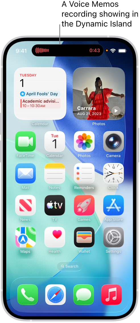
Apple iPhone showing a live activity in the Dynamic Island
Reference image: Apple iPhone User Guide. View source
Example 09

Apple Dynamic Island: keep live status available without taking over the screen

Some activities matter continuously but do not deserve a full screen. A recording, route, call, timer or delivery can remain useful while the person is doing something else.

Apple's Dynamic Island gives these activities a persistent place at the top of the interface. A person can glance at status, expand an activity for more detail, collapse it again or switch between activities.

The important idea is spatial continuity. The user learns where live activity lives, so status can remain available without repeated popups or forced navigation.

WLW lesson: Persistent information should occupy a predictable place and demand attention in proportion to its importance. Not every update needs a modal window or interruption.
Spotify tablet interfaces showing adaptive layouts in different orientations
Reference image: Spotify tablet experience, April 2026. View source
Example 10

Spotify: design for the device, not just the screen size

Spotify's 2026 tablet refresh is a useful example of interaction changing with context. The interface does not simply enlarge the mobile layout. It uses the available space to let people browse while something is already playing.

The refreshed experience includes adaptive orientation, a collapsible sidebar and parallel browsing. Core navigation stays familiar while the structure changes to suit a larger screen and a different pattern of use.

Responsive design is more than fitting the same components into different widths. The interaction can change because the user's posture, attention and available space have changed.

WLW lesson: Ask what becomes possible on each device. Preserve familiarity where it helps, then adapt the interaction to the context instead of merely scaling the interface.

What the best interaction design examples have in common

The visual styles above are completely different. The underlying behaviours are much closer. Strong interactions tend to reduce uncertainty and keep people oriented.

Acknowledge meaningful actions

A click, submission or change should produce a response which confirms the system understood it

Keep important state visible

People should not have to remember what they selected, submitted, saved or changed

Preserve context

Changing a filter, payment method or detail should not unnecessarily throw the user into a new journey

Reveal complexity when it becomes useful

Show the information needed for the current decision and bring in more detail as the task demands it

Make recovery part of the design

Mistakes, changed minds and interrupted tasks are normal. Good interfaces give people a clear route back

Match attention to importance

A live status can remain quietly available. A critical security action should be impossible to miss

Design for the physical situation

Hands, screen size, movement, noise, time pressure and device type all change what a useful interaction looks like

Make behaviour feel like the brand

Brand experience is built by how the product responds as well as how the interface looks

How to spot interaction problems on your own website or app

Walk through the journeys which matter commercially and answer the questions below. Use a real mobile device as well as a desktop screen. Test the awkward states as carefully as the happy path.

Can a person tell what the main action on the screen is?
Does every important action produce immediate and understandable feedback?
Can the user see what has already been selected, saved or submitted?
Does the next step remain obvious after the interface changes?
Can a person correct a mistake without losing unrelated work?
Are forms asking only for information needed at that stage?
Are loading, empty, error, success and confirmation states properly designed?
Do filters and choices show their effect before the user commits?
Are critical controls clear enough to use under pressure?
Does the mobile interaction work for fingers and one handed use?
Does the interface preserve useful context when somebody goes backwards?
Does the behaviour feel consistent with the impression the brand wants to create?

Interaction design starts with the task, not the animation

WLW starts with what people are trying to achieve and what the business needs to happen next. Research, analytics, customer behaviour and commercial priorities decide where an interaction needs changing. Design then gives the journey a clearer structure and a more useful response.

1. Understand the taskIdentify the user intention, business outcome, context and point where confidence or progress is being lost
2. Map the statesDesign the beginning, choice, progress, success, error, empty and recovery states instead of drawing one ideal screen
3. Prototype the behaviourTest what happens when somebody clicks, changes their mind, submits the wrong thing or returns later
4. Remove unnecessary effortReduce repeated input, irrelevant choices, dead ends and navigation which adds no value to the task
5. Build for accessibilityInteraction has to work with keyboard input, screen readers, zoom, clear focus states and different physical abilities
6. Measure what happensUse analytics, session evidence, form performance and conversion data to see whether the changed interaction improves the outcome

Every interaction contributes to the impression

WLW can review the brand, website, search visibility, AI visibility, customer journey and conversion points which shape the picture people form and what they do next.

See where people are being lost, confused or left without a clear next step, then decide what should change.

Get my full online presence audit

Image publishing note: the reference images currently load from the named organisations’ official web properties and each example links back to its source. For the live WLW post, use approved copies in the WordPress Media Library where appropriate and keep the source credit.

Sources and reference material

  1. Interaction Design Foundation. Interaction design definition and five dimensions.
  2. GOV.UK. Reference product image and interaction example.
  3. Wise. Reference product image and interaction example.
  4. Stripe. Reference product image and interaction example.
  5. Airbnb. Reference product image and interaction example.
  6. Google Maps. Reference product image and interaction example.
  7. Duolingo. Reference product image and interaction example.
  8. Figma. Reference product image and interaction example.
  9. Monzo. Reference product image and interaction example.
  10. Apple Dynamic Island. Reference product image and interaction example.
  11. Spotify. Reference product image and interaction example.
Share your love

Leave a Reply

Have questions or want to arrange a short call?

Email:
Address:
4 Capricorn Centre
Basildon
Essex
Great Britain
SS14 3JJ
Here is where to start: https://wlwfuture.com/brand-website-and-marketing-diagnosis-tool/

You enter your website and a few details about your business.
We run a structured analysis across how your brand, website and marketing are performing. This covers messaging, user experience, technical performance, visibility in search and AI search, and how your current activity is likely to be converting.

You receive a clear breakdown of what is working, what is underperforming and where the biggest opportunities are.
No guesswork. No generic advice. Just a practical view of where performance is being lost and how it can be improved.

We will show you how we would fix it. If not, you still leave with a clear understanding of where you stand.
This depends on how you engage with WLW. Daily website tasks start from £25, and entry-level advertising channel management starts from £999 per month.
WLW FUTURE is UK-based, but we deliver projects and campaigns globally through our core team and wider associate network. We regularly support work across Europe and other international markets, depending on the scope and requirements.

We also have a presence in Lyon, which acts as a base for France and wider European activity.

Our team operates across multiple languages including French, Hindi, Chinese, Russian, Somali, Spanish, Norwegian and Swedish, allowing us to deliver campaigns that are properly adapted to local markets rather than simply translated.
No. Campaign work can be run on a pay-as-you-go basis. For project work, we agree scope and pricing upfront, but we avoid unnecessary long-term contracts.
Yes, in selected cases. If there is clear commercial potential, we are open to structured commission or performance-based agreements, subject to a fair agreement.
Yes. This usually happens when execution is restricted by requirements that go against how marketing and advertising actually work. We are always clear that results are not always immediate. Some campaigns take time to build momentum, and that is normal.
“Helping brands get on top of things.”

WLW FUTURE is a creative media and operational hybrid agency. Every project starts lean and remote, led by one senior specialist per task, project or campaign. If more depth is needed, we scale from within our 20+ core team to deliver end-to-end. For larger or more complex programmes, we extend into a trusted partner network.

The result is a joined-up delivery model with fewer layers, faster execution and better commercial focus.
We work across paid social including Meta, TikTok, YouTube, Pinterest and Snapchat, as well as online publications. Paid media covers native, programmatic, ATL, direct buys, display and SEM. We also focus on AEO, which is query-led visibility across AI and search environments.

Our work includes digital PR and affiliate activity such as outreach, influencer partnerships and affiliate marketing. We plan and deliver content strategy across themes, formats and campaigns, supported by creative production including video, animation, graphics and campaign assets.

Performance is tracked through cross-channel analytics, ROI measurement and reporting, alongside audience data collection and insight analysis. We also manage and grow organic social across all major platforms.
Yes, it is one of our core channels and one of the closest things to word of mouth when done properly. We have been working in this space since 2014, combining strategy, content and automation to drive consistent results.

We use the latest platforms and technologies to maximise performance, from list growth and segmentation through to campaign optimisation and lifecycle automation, ensuring email becomes a reliable and scalable revenue channel rather than just a broadcast tool.
We usually enter at the point where a business knows something is not right.

Before a website rebuild or platform investment.
When marketing spend is increasing without clear returns.
When entering new markets or repositioning.
When growth has plateaued or become inefficient.
When internal teams need clearer structure and direction.

From there, we connect the pieces and build forward.

Newsletter signup

Enter your email to receive exclusive research and insights from the WLW FUTURE team. By signing up you agree to our privacy policy.
Subscription Form (#3)

Book a 15 minute requirements call

We'll reply back and arrange a suitable time of your choosing.
book 15 mins